
Sunday, February 28, 2010
How Kiva works.
Here's a little "How Kiva Works" illustration a lender made that I thought was worth sharing. -Tamara

Wednesday, February 24, 2010
Food For thought
Hey Guys
Lots of cool stuff last night!!!
Anywho, I ran across a couple neat things today, figured I'd share!
Enjoy
Mike

Witness the power of Facebook
Cool Online Book
Lots of cool stuff last night!!!
Anywho, I ran across a couple neat things today, figured I'd share!
Enjoy
Mike
Witness the power of Facebook
Cool Online Book
Tuesday, February 23, 2010
Adidas Basketball You Tube Interaction


Interactive You Tube Window showcasing Dwight Howard's newest line of shoes. Naturally, Adidas shows you how the shoes make Dwight faster, stronger, and lighter. I'm really attracted to this style of advertising, not only because it's interactive, but because of how company's are starting to move towards low consequence methods of showing their brands, products and services. Adidas is also fully advocating their facebook as the main go-to page on their commercials to connect with their "fans." This is a great innovation to an already buzzing channel of communication and we can only expect more to come from companies like Adidas to further connect with their consumers using the methods of communication they love most.
Unfortunately it's not embeddable by HTML, but check it out here!
Recognizr: An Augmented Identity App
RE-BLOGGED FROM: GOOD Blog > Andrew Price
Original Post
There's been lots of talk about augmented reality. In this video (after the jump) see what the beginnings of augmented identity might look like. This app, Recognizr, can learn to recognize people's faces and link them to their social networking identities.
This is a prototype, but I think it's clear that advances in computer vision are going to really transform technology in the near future. Pretty soon, our phones will be able to recognize anything (and any external camera will be able to recognize us).
Original Post
contrary to polular belief, Nokia is pretty awesome
remember Nokia?
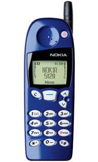
I do. It was my first cell phone and i was bad-ass cause i went to the Valley Fair Mall in San Jose, CA and had it transformed into an all white plastic monstrosity that i used primarily to play snake.
well, Nokia, at least for me, has lost it's significance as a phone manufacturer. I've had nothing but Palm's since my first white plastic brick, and i am totally iphone aspirational (did you hear me now Verizon Wireless?!)
anyways, i digress....
I had a meeting at work monday and my GCD showed our team this video:
How awesome is that? When a campaign becomes an experience? It's something you can interact with, it's extroverted and social, heavily visual and a platform for people to talk to and about. But the flip side...what is the impact POST the "giant arrow"...an IA here asked the same question, and for me, it brought up a lot of valid questions. Loudest is indeed, what DOES happen after a flash in the pan? We're left with second hand accounts, a video and a dead website. So how do you mix something so innovative into something that has legs to stand on and space to grow? How do you change the game, create something beautiful AND meet the marketing brief requirements (and satisfy not only the client, but the targets as well)? How to create something award show worthy but actually has relevance and longevity in the marketplace?
enough rainy day ramblings, i have a date with a meatball sandwich-
see you all later
Mike
I do. It was my first cell phone and i was bad-ass cause i went to the Valley Fair Mall in San Jose, CA and had it transformed into an all white plastic monstrosity that i used primarily to play snake.
well, Nokia, at least for me, has lost it's significance as a phone manufacturer. I've had nothing but Palm's since my first white plastic brick, and i am totally iphone aspirational (did you hear me now Verizon Wireless?!)
anyways, i digress....
I had a meeting at work monday and my GCD showed our team this video:
The World's Biggest Signpost from adghost on Vimeo.
How awesome is that? When a campaign becomes an experience? It's something you can interact with, it's extroverted and social, heavily visual and a platform for people to talk to and about. But the flip side...what is the impact POST the "giant arrow"...an IA here asked the same question, and for me, it brought up a lot of valid questions. Loudest is indeed, what DOES happen after a flash in the pan? We're left with second hand accounts, a video and a dead website. So how do you mix something so innovative into something that has legs to stand on and space to grow? How do you change the game, create something beautiful AND meet the marketing brief requirements (and satisfy not only the client, but the targets as well)? How to create something award show worthy but actually has relevance and longevity in the marketplace?
enough rainy day ramblings, i have a date with a meatball sandwich-
see you all later
Mike
Monday, February 22, 2010
In responce...
to W+K Dodge Charger Super Bowl spot by ?, but apparently there have been a few of these.
Parked hearse serves up gravest advertising
Undertakers in Schaerding, Austria, have caused a fuss by parking a hearse at a notorious accident spot and posting an ad on the vehicle's side that reads: "We're always ready for you." In poor taste? Oh, sure. A town rep goes a step further, calling it "macabre and pitiless." And he's right. But wait until he sees the company's next project: a calendar with scantily clad women standing next to coffins. The undertakers promise "a high-value, aesthetic presentation," but we're expecting a train wreck of G. Gordon Liddy-esque proportions.
—Posted by David Kiefaber on AdFreak
Sunday, February 21, 2010
Little more Old Spicey Spice
Look at the screen, look away, now back at the screen. Speaking of green screen. Where are you? Your on the internet, with a blog update that's a blatant copy of an Old Spice spot. What's on your computer, I have it. It's a post of a video I found today. The post is now diamonds. With advertising, anything is possible and hopefully this video will inspire you the same way it did me, to make advertising fun.
I'm on a horse.
I'm on a horse.
Thursday, February 18, 2010
It's Two Things
Thanks for sharing some Old Spice work, Jordan. Wieden + Kennedy in Portland has been doing some amazing work for Old Spice online and off. Below is one of is one of my favorites executed in both print and TV. Both shot using a green screen. -Jon


A look into the past -- Khaki Swing
On March 31st, 1999 The Matrix was released and popularized the use of a visual effect known as "bullet time". Well if you want to see a precursor to “Bullet Time”, The Gap had a series of televised ads for their newly released khakis known as 'Khaki Swing' in 1998. Not only did they allows the viewer to explore a moment progressing in slow-motion as the camera appears to orbit around the scene at normal speed but helped revive swing music in the late 90's.
I think it's awesome to see some technology that hadn't been as popular at that time, juxtaposed with music from the 50's and 60's and have the end result become so successful. As we look ahead towards Future Lions, I can only imagine how cool it would be to be the ones who use a new technology before it's popularity. How can we use the latest and greatest to our advantage and kick start a whole new craze?
I think it's awesome to see some technology that hadn't been as popular at that time, juxtaposed with music from the 50's and 60's and have the end result become so successful. As we look ahead towards Future Lions, I can only imagine how cool it would be to be the ones who use a new technology before it's popularity. How can we use the latest and greatest to our advantage and kick start a whole new craze?
Wednesday, February 17, 2010
We are all familiar with the Old Spice T.V. spots I hope, "the tickets are now diamonds." this was another avenue of that campaign that I found quite entertaining. Now it only took me a few minutes, but this article highlights the flip side to the equation we are forced to solve every time we're handed an assignment.
Fun takes time over at Old Spice's microsite
The Web is awash in time-wasting activities. That makes it hard for brands to stand out with check-the-integrated-box microsites. Lots of brands seem to miss the essential component of the most popular silly online apps: They're simple. Wieden + Kennedy rolled out a Valentine's Day microsite for Old Spice for people to send Someecards-lite ironic declarations of devotion to their significant others. (Sample: "I'll love you until the end of time, at which point I'm not sure what technically happens.") Fun! The problem is, sending this to someone is excruciating. First, the site is age-gated, requiring users to fill in their date of birth and state of residence. To send a greeting, you need to enter your e-mail address and then wait to get a verification link to be sent to you. Fifteen minutes after starting the process, I'm still waiting for that link. Who has that kind of time for Old Spice? It's particularly disappointing considering how well-done the recent Old Spice TV spots are. Ad agencies that tout their ability to make culture have to understand digital culture better to know that these kind of clunky executions won't cut it. The good news for Wieden is, it recently hired Poke co-founder Iain Tait, proponent of the KISS ("Keep it simple, stupid") style of digital work.
—Posted by Brian Morrissey
MYSTERIOUS CORDUROY - LEVI'S
So, Levi's is promoting their "opening ceremony" of cords on 2/20/10. In the last couple of weeks, I've been seeing lots of random things being covered by corduroy, from dozens of bicycles, signs, sign posts, etc. mainly all in the Mission. Yesterday when I was walking home from the fabric store, I saw an entire wall covered with multi-colored sheets of corduroy advertising Levi's cords. Of course, my boyfriend and I tore the last three down.
This was a great and bizarre campaign, because I remember overhearing people talk about these randomly wrapped-in-corduroy objects that I shrugged off as just another San Francisco being bored and trying to "express themselves"
Anyways, I thought it was pretty funny that people finally figured it out.
Here is a link:
http://missionmission.wordpress.com/2010/02/17/corduroy-corner/
Tuesday, February 16, 2010
My Portfolio
Hey Guys
here's a some work i have online-
thanks and see you all in a bit
My carbonmade
ps: ever since I saw Betty White get tackled at the Super Bowl, I've been a fan of the new Snickers spots:
here's a some work i have online-
thanks and see you all in a bit
My carbonmade
ps: ever since I saw Betty White get tackled at the Super Bowl, I've been a fan of the new Snickers spots:
some of my portfolio
about a year old, haven't uploaded very much new stuff.
check it out, I want to see my Google Analytics peak!
jmacha.carbonmade.com
check it out, I want to see my Google Analytics peak!
jmacha.carbonmade.com
You, Too, Can Soon Be Like Tom Cruise in ‘Minority Report’
The New York Times
By JENNIFER 8. LEE

John Underkoffler, who helped create the gesture-based computer interface imagined in the film “Minority Report,” has brought that technology to real life. He gave a demonstration at the TED Conference in Long Beach, Calif., on Friday.
Hollywood imitates life. And sometimes life imitates Hollywood.
John Underkoffler, who led the team that came up with the interface that Tom Cruise’s character used in the 2002 movie “Minority Report,” co-founded a company, Oblong Industries, to make the gesture-activated interface a reality.
Using special gloves, Mr. Underkoffler demonstrated the interface — called the g-speak Spatial Operating Environment — on Friday at the annual TED conference in Long Beach, Calif., a series of lectures by experts across a variety of technologies.
He pushed, pulled and twisted vast troves of photos and forms that were on a screen in front of him, compressing and stretching as he went. He zoomed in, zoomed out and rotated the images using six degrees of control. In one part of the demonstration, he reached into a series of movies, plucked out a single character from each and placed them onto a “table” together where they continued to move. (Oblong has released its own demonstration video).
In this conception of computing, the input and the output occupy the same space — unlike a conventional computer, in which the mouse and computer keyboard are separate from the screen, where the changes appear. Even the Nintendo Wii game console, which responds to gesture and motions, often projects that motion onto an on-screen figure.
Mr. Underkoffler said this gesture technology was already being used in Fortune 50 companies, government agencies and universities, and he predicted that it would soon be available for consumers. “I think in five years’ time, when you buy a computer, you’ll get this,” he said.
In fact, consumers will get the first taste of gesture-based interfaces later this year. As The Times reported last month, Microsoft, Hitachi and PC makers are on the brink of rolling out game consoles, televisions and computers that use gestures to control the machines.
Gesture-based interfaces are among the most significant advances in computer interface design since the mid-1980s, and they are part of a trend of accelerating advances in how humans interact with computers.
Oblong officially came out of stealth mode in November 2008, but Mr. Underkoffler said the TED demonstration was the public “coming out” of the company’s technology. Oblong, which is based in Los Angeles, now has around 25 employees.
The old model of “one human, one machine, one mouse, one screen” is passe, said Mr. Underkoffler, who spent 15 years at the MIT Media Lab before co-founding Oblong.
Mr. Underkoffler was working at the MIT Media Lab when Alex McDowell, the production director for “Minority Report,” visited in search for ideas for a fictional world set five decades into the future. Mr. Underkoffler was hired to be a science consultant for the film, with a particular emphasis on a computer interface that would be used in some key scenes.
In developing the vocabulary of motions and gestures for the actors, he deepened his understanding of how humans interacted with the technology. In filming, the actors were mostly miming and the images of projected data were added later, making the entire situation seem real.
The experience sharpened Mr. Underkoffler’s desire to make the technology into something commercially viable.
Sprint: Plug into Now
Lately Sprint has had some very interesting, fun and creative advertising. With updates to their 'now' network, 3G and 4G connectivity and tons of new amazing phones, they've released tons of sexy motion adverts and interactive microsites.
Plug into Now- http://now.sprint.com/
 This version of their 'now' sites leans towards the speed of thier network and offers tons of customizable widgets all illustrating things that are happening now. With just a little time spent on here you'l find tons of interesting and even useless stuff happening now -- things like amount of 911 calls being made, dog daycare webcams, babies being born, you name it! You can even add yourself into the network of widgets. Such a great and creative way of illustrating what's happening NOW.
http://now.sprint.com/nownetwork/ - Focusing on their mobile network
http://now.sprint.com/android/ - With the release of Android on Sprint
and the list goes on and on...
Plug into Now- http://now.sprint.com/
This version of their 'now' sites leans towards the speed of thier network and offers tons of customizable widgets all illustrating things that are happening now. With just a little time spent on here you'l find tons of interesting and even useless stuff happening now -- things like amount of 911 calls being made, dog daycare webcams, babies being born, you name it! You can even add yourself into the network of widgets. Such a great and creative way of illustrating what's happening NOW.http://now.sprint.com/nownetwork/ - Focusing on their mobile network
http://now.sprint.com/android/ - With the release of Android on Sprint
and the list goes on and on...
Netflix Queues on Google Maps
Looks like the Bay doesn't have a temple for Indiana Jones. Very cool use of Google Map's API. -Jon

http://www.nytimes.com/interactive/2010/01/10/nyregion/20100110-netflix-map.html?ref=technology

http://www.nytimes.com/interactive/2010/01/10/nyregion/20100110-netflix-map.html?ref=technology
Sprint's 3d motion adverts
Kiva Collaboration PDF presentation
Here's GROUP THREE'S presentation.
Chris Vilchez
William Chu
Sandra Hong
Patrick Gulpo
Jordan Goldschmidt
Tim Labrie
Creative advertising that makes you look twice
Creative advertising that makes you look twice
Advertisements usually have a negative connotation associated with them and because of this most people don't like taking the time look at and even read advertisements. The good news is, not all advertisements are bad and some companies have taken the time to design some very clever advertising campaigns.
http://www.pronetadvertising.com/articles/creative-advertising-that-makes-you-look-twice.html
Monday, February 15, 2010
Portfolio
Here's my old portfolio. I am currently working on the new and improved one.
http://www.scribd.com/doc/26918714/Rodel-Borja-Portfolio
http://www.scribd.com/doc/26918714/Rodel-Borja-Portfolio
Stuff
Campaigns I worked on for Campaign Design last semester.
Portfolio: Selected Work
Hahah...Everyone has said I need to redo this or put my new stuff. Ditto, I have some new stuff thats either at press or needs to been shot in the studio to thow in. But here are some selected works.
www.jameslloydnelson.com
Should update it with in the month; with a shoe design, and a wheel series I worked on and art directed that just came out
www.jameslloydnelson.com
Should update it with in the month; with a shoe design, and a wheel series I worked on and art directed that just came out
Sunday, February 14, 2010
converse
This is a pretty weird ad campaign that I saw for Converse. I haven't looked at every site on the page but basically they created a ton of different microsites all for Converse and all of them are seemingly completely random. They all have a similar feel that I guess the brand is trying to go for now, I've never really looked for any Converse stuff online before but it definitely seems likes its very different than anything I've seen in the past from them. The main page is http://www.thisistheindexpage.com/ and there are just a ton of thumbnail links to the other sites. I'm not really sure of the purpose of everything on there but I guess it could create a lot of buzz considering how weird some of them are. Some of them, like the Converse Spelling Bee asks for you to interact and go to different pages to look for words, while some others are just videos.
Saturday, February 13, 2010
Ehhh.. I'm finally getting around to redoing my portfolio. Y'all gonna be the last set of eyes on this old thing...
http://chrisvilchez.com
Friday, February 12, 2010
I should be updating this.
Maybe a crash course on how to make an easy to maintain website?
http://taiyokitagawa.com
Maybe a crash course on how to make an easy to maintain website?
http://taiyokitagawa.com
Thursday, February 11, 2010
Wednesday, February 10, 2010
be gentle
http://josieng.com
Currently only art direction in advertising, but in the process of getting my previous/present graphic design work up :)
Currently only art direction in advertising, but in the process of getting my previous/present graphic design work up :)
Tuesday, February 9, 2010
Nike fullscreen video site
Good example of utilizing full-bleed Flash video & inventive NAV. -Jon
NSW Collection
NSW Collection
What is your type.
I think this is a really interesting and interactive project done by Pentagram a firm thats done a lot of different projects for people like Pantone, they did the bags for Sak 5th Av, the Truvia packaging which won a couple awards last year. This project though is more about type and it's all about going through the options and picking options and from there they assign you a typeface, it's interesting different and kind out funny the questions asked, of course the demographic is a bit short but it's there and mostly just for designers and such, check it out.
Chris
Pepsi - Oneify
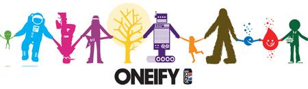


This campaign is great. It didn't run that long ago, so you may remember it. LA based artist and designer Geoff McFetridge made a simple, powerful and human ad campaign based on doodles of characters holding hands, or "oneifying". It's apropos the last decade's art and design movements. Doodles, hand-rendered text and simplicity are all fixtures of the current design trends from the humanist camp. It is designed well, consistent yet varied, non-intrusive but engaging. Best of all, it never says a damn word about that wretched black tar, Pepsi Cola.
Here is a funny aside related to the campaign. While looking for images, I found posts made by two people when Pepsi launched a new media campaign over TV spots:
"Really - do we need fake people looking like an iPod ad gone
retarded selling us one-calorie Pepsi? Maybe the 2nd grade set,
who in my day were into scratch-n-sniff stickers, is the target
audience here. Seriously, can anyone really believe this concept
got approval from anyone? - At least it's cheap..."
"That is some old farts sitting in a board room saying "we are hip and cool" We can prove it with one of them fancy new web sites on the innernet. Do it in flash with sound. The new generation is all about world peace, racial equality and tree hugging, so lets make them all different and holding hands in a circle (peace) and _literally_ hugging a tree. They probably gave millions to some marketing firm to come up with the idea."
These two don't realize it's just one artist having fun with a concept. Maybe they would have responded to special effects and nudity?
- Jason
Google Buzz
With micro-start ups like Twitter and Facebook growing to mega-platforms for social media, it's no surprise that Google has had this up their sleeves all along. Google buzz seems to be the perfect integration of all the tools Google has constructed. Consider Gmail the gateway drug in attracting the netizens to Google's brand, thus exposing them to further features such as YouTube, Reader, Docs, Flickr, and now Buzz. We're finally liberated from 140 characters or less to the freedom of the web, giving strength to the blogger, the follower, the reader, and ultimately making the internet that much more useful and shareable.
Thoughts about things and stuff
hey all
so after seeing the new pepsi ad which looked oddly familiar...it got me thinking about how different, cool or innovative projects/art that commercial art "adopts" and uses as a vehicle for communication-examples below. Anyways, do you guys have any other examples off the top of your head, how do you feel about this re purposing? is this the death of originality?
These examples are pretty awesome and totally addictive, but you have to check the links out-
TONE MATRIX
INFINITI STAR MATRIX BANNER
-Mike Dorsey
Super Bowl Ads
Maybe I missed the better ads this year but Intentionally tried to watch the Super Bowl ads, and did not find anything out of the ordinary or over the top like usual. I was somewhat disappointed and only remember seeing less then a handful of great ads. Thanks for letting me down Super Bowl Ad department :)
I phone Aug Apps
Amazing Augmented Reality iPhone Apps
 While Lawnmower Man may have led us to believe the future was a virtual one, it seems that in fact augmented reality (the overlaying of digital data on the real world) is where we’re headed.
A buzz technology right now, augmented reality apps are quickly gaining momentum on the iPhone. So to add to the quick overview of six AR apps we brought you earlier, we sort the digital wheat from the pixellated chaff to bring you ten AR apps for the iPhone that vary from functional, to educational, to just plain fun.

Although the wisdom of getting drunk people to wave their iPhones around on today’s mean streets is questionable, if you drink responsibly, as this Stella Artois-backed app urges you to, this could be a handy tool. As with similar location-based AR apps, Le Bar (that’s French for bar, by the way) Guide will assist you in finding the nearest watering hole, give you ratings and then even point you to a taxi within stumbling distance. It’s accurate to 20 feet, which is a coincidence, as that’s about our level of accuracy after three pints of the French stuff.
5. AugMeasure

Finally an iPhone app your dad can get excited about. Augmented reality measuring arrives with AugMeasure which lets you gauge short distances using on your iPhone’s camera. AugMeasure displays distances (up to 30 centimeters or 12 inches) on the screen overlaid onto the live image which will change as you move the phone. While the results might not be precise enough for that intricate woodworking project you’ve got going on in the basement, for those quick, “No, it’s definitely longer than 6 inches” moments, it’s a must.
8. Car Finder

We’re sure you have no use for this one yourself, but if you know anyone who might have difficulty finding their way back to the car in those huge parking lots, then the Car Finder app is a good suggestion. Once the car’s location is set, the app creates a visible marker showing the car, its distance away and the direction in which to head. There are other non-AR apps which offer this kind of tool, but we think seeing it on a real-life display will make locating that pesky Pontiac a piece of cake.
Zune Adverts
For the Ads themselves, they're nothing but art pieces. They don't say anything about the product or try to pitch you a sales. What they really want consumers to see is that you can personalize your zune to your own style, as opposed to their competitors where you're set to having one certain look, feel etc. I may agree to the general idea, but what I see coming from these advertisement is a certain demographic forming. A demographic catering strictly to young adults that are "hip" to musical standards. Which in my opinion is terrible marketing.
But I do love these ads. They totally cater to my taste.
Monday, February 8, 2010
Tetris Returns
When I first saw this campaign for Hangame Tetris, it immediately caught my eye and led me to think--where the hell did Tetris ever go and why is it calling 'Hangame' home?
After a little searching it became clear to me that Hangame is a popular online gaming portal in South Korea similar to Valve's Steam community and platform here in the US. Hangame had lost it's licensing agreement for Tetris when they decided not to renew and now Tetris is back on their servers! A little YouTube search led to evidence of how popular this game has gotten with the online community. Although that comes to no surprise, who doesn't like Tetris??
A little imaging work and a creative set of minds brings the world of Tetris into these beautiful skyline shots of popular cities such as London and New York. The shape and outline of these cities' skyline is practically begging for this sort of treatment.
Advertising Agency: Daehong Communications, Seoul, S.Korea
Here's the game in action.
Project One Kick-off 2/9: Kiva.org
Tamara Khan & Jeremy Anderson from Kiva.org will be joining us in class to tell us about our exciting first project. We're extremely lucky to have an opportunity to help such a dynamic & socially conscious brand revamp their online presence. We can't even imagine the cool ideas you all will come up with.
Please find out more about Kiva here: Kiva.org
Thanks, Amir. Here's a little Super Bowl playlist i put together.
Watch for the Google spot. At first a TV spot with a search box in it isn't all that interesting. But Google tells the story of what they do in a way that's engaging and emotional. -Jon
Super Bowl Ads
Ads this year cost at least $2.6 million for a 30-second spot that's over $43,000 per second. Was it worth the risk? Maybe, with this year's Super Bowl becoming the most watched televised event in US history. With 106.5 million viewers that's almost 1 in 3 Americans. Anyways here is one I found entertaining.
Added info:
http://www.entrepreneur.com/advertising/adsbytype/tvads/article173874.html
http://www.thrfeed.com/2010/02/super-bowl-xliv-ratings-.html
http://blog.newsok.com/nerdage/2010/02/07/super-bowl-ads-5-best-5-worst/
-Amir
Added info:
http://www.entrepreneur.com/advertising/adsbytype/tvads/article173874.html
http://www.thrfeed.com/2010/02/super-bowl-xliv-ratings-.html
http://blog.newsok.com/nerdage/2010/02/07/super-bowl-ads-5-best-5-worst/
-Amir
Sunday, February 7, 2010
IKEA, again.
Talking about IKEA.
This commercial is old and all of you have probably already seen it. Nevertheless, it is a great video that really shows IKEA's true identity as a brand. Hilarious.
No more IKEA now, promise..
This commercial is old and all of you have probably already seen it. Nevertheless, it is a great video that really shows IKEA's true identity as a brand. Hilarious.
No more IKEA now, promise..
Simplicity.
This simple, but very effective campaign utilizes Facebook and image tagging for a new IKEA store in Malmo, Sweden. I really like how the agency used existing technology and almost no money to create such a buzz about something so boring as a new IKEA store.
Saturday, February 6, 2010
AdFreak: Videogame ads hidden in sites' source code
Thought this was interesting, although very specific when it comes to the audience. Good/Bad?
A few months back, we dinged the Dante's Inferno marketing crew for being disgustingly over-the-top with their guerrilla marketing of the new EA videogame. So, it's a bit strange to see that their newest tactic is subtle to the point of invisibility. The marketers paid to place ASCII art in the source code of popular Web sites like Digg.com. (You can see all the screenshots here.) Once they actually found out about it, site visitors were split on whether this was creative or just pointless—though the answer is probably both. The art ends with a link to HellisNigh.com, where you need six passwords obtained from sites that embedded the images. Your reward is a large bushel of desktop wallpapers, posters and other artwork promoting the game. One interesting element of this campaign is that it came as a surprise to several of the people who work for the sites involved. "Checked the source code of our front page lately?" asked video game blog Kotaku. "We didn't think to until we got a tip. … Kotaku's editorial operation had no knowledge this was being done." Hat tip to my friend Christian, without whom I surely wouldn't have known this was being done either.
—Posted by David Griner
Friday, February 5, 2010
Augmented Reality Stuff
I'm not sure if everyone's already seen this but it's a pretty cool augmented reality thing using a t-shirt. Just another cool look at what augmented reality can do. But I'm sure it can still be used for even better things that we haven't thought of yet, like we said in class.
-Patrick
Thursday, February 4, 2010
Google Image Swirl

Google Image Swirl organizes image search results into groups and sub-groups, based on their visual and semantic similarity and presents them in an intuitive exploratory interface.

There's this branch in computer science and statistics for vision research. Normally, if you ever hear about it in the news it's in the context of spotting terrorists in security tapes or facial recognition checkpoints (you know, like what they have in movies in front of giant steel doors). That is of course not the only application.
Google (and many others) has been playing around with this stuff for a while. Most recently, they released Google Image Swirl in their labs section, which utilizes computer vision to find similar images."
-Jon
Google Image Swirl Labs
VW launches first smart phone optimized site

VW Press release
HERNDON, Va., Oct. 12 /PRNewswire/ -- Volkswagen of America, Inc. today announced the launch of their smart phone-optimized mobile website, m.vw.com. The mobile website is compatible with all web-enabled cell phones and mobile devices.
"When we designed our mobile site, we kept in mind that many of today's consumers are constantly on the go," explains Charlie Taylor, general manager of digital marketing and motorsports for Volkswagen. "We focused on location-based services such as the ability to find a dealer, schedule a test drive, and get a quote," added Taylor. The result is a service that can help consumers and owners find the information they need when they need it.
According to the CTIA Wireless Association, there are over 270 million mobile consumers in the U.S. This represents 88% of the population, emphasizing that most Americans use their cell phones to help navigate their lives and accomplish daily tasks.
Instead of doing research about a new Volkswagen from home, potential owners can now find a vehicle they're interested in while on the way to their Volkswagen dealership. And, if they have any questions before they arrive, the Volkswagen dealer's number is just a click away.
Designed and implemented by interactive agency AKQA, the new site reflects Volkswagen's dedication to innovation and quality. It gives customers all of the important information from vw.com tailored for the convenience and flexibility of a mobile site. Customers have instant access to Volkswagen's full model range of vehicles, along with links to national and regional special offers. Visitors to the site can also pick up free exclusive ringtones and wallpapers featuring popular imagery and sounds from recent Volkswagen advertising.
Go here on your smart phone:http://m.vw.com
Here's a big idea. A parking spot finder for your pocket.
The Park Shark App

http://www.parkshark.mobi
It's not an ad or a site or a widget. It's not for a particular brand. It's just a great idea that helps people. And it will make the guy who made it a shitload of money. -Jon

http://www.parkshark.mobi
It's not an ad or a site or a widget. It's not for a particular brand. It's just a great idea that helps people. And it will make the guy who made it a shitload of money. -Jon
Skittles gets worked over online.
From Ad Age.com:
Big Spaceship gives Skittles.com a makeover.
Skittles.com gets a new makeover, courtesy of Big Spaceship. The site invites visitors to "experience the rainbow" with an neverending scroll of off-kilter, shareable content as well as a microsite created out of FirstBorn, in which Skittles fans can upload videos of themselves either pitching or catching Skittles, and then watch side by side films interact with each other.
The endless, downward navigation is reminiscent of Japanese agency Bascule's website as well as the Orange Good Things Should Never End campaign out of Poke London.
-Jon
Choose a Different Ending
This is a campaign for droptheweapon.org, a project to educate people how they can turn away from violence and crime.
The viewer can choose different endings on the youtube video, which leads you to the next scene depending on what you choose. It educates viewers how making choices can affect your life in an engaging way.
BBDO London
Wario Land/ Intel
Wario Land
I love what Goodyby, Silverstein and Partners did with Wario Land. It's innovative, fun, and really showcases the features of the game itself.
The link below explains how they created the ad.
or check it out at youtube
I can't embed it here because you have to watch it on youtube since it's made specifically for that atmosphere.
Intel
DDB in Brasil created a kickass "screensaver." They created screensavers where users can upload it and turn monitors into a race track. What I like most is how they took boring screensavers and made it interactive and fun.
Playbook, Faceboy or just lame?
Something else I ran into. Not exactly integrated but a... way to get females actively involved with the brand? Looks like a new way to wrap Photo Booth.
Agency: ?
Agency: ?
Wednesday, February 3, 2010
Refresh Everything
Refresh Everything - I Care About...

http://www.refresheverything.com/
As much as I hated the look and feel of the Pepsi rebranding, I think that this is a great idea. Whether or not this was in their plans in their beginning print launch, they initially rebranded Pepsi with their disgusting new logo, and offered to viewers a new chance to look at Pepsi through short phrases like "hope" "lol" and "omg" (genius, I know), replacing the "o" with their lovely new logo.
Since then, they have taken upon the "Refresh Everything" point of view and pushed with the green/changing the world movement. They now target the audience with radio spots and TV commercials asking them to submit to Pepsi their GREAT IDEA, that will change the world or even your own community. The best ideas will be voted in a democratic fashion and then given tons of $$$ to actually follow through with this idea. It's a great way to get the community talking as well as a lot of user participation.
TBWA\Chiat\Day LA, CA
ADIDAS ORIGINALS/STAR WARS
This commercial is hands down my favorite work in 2010 so far. Old school Hip Hop, DJ Neil Armstrong, Snoop Dogg, Daft Punk, post-apocalyptic city scenery, and Star Wars...this not only defines the brand, but launches the campaign perfectly. They did an amazing job blending the two as well, which is exactly how and what the new product line is suppose to represent. The ships blazing by as they run up the stairs, the sound of the lightsaber while they play stick ball, and the explosion at the same time the dj drops the track, this attention to detail and perfect mesh makes any one interested and bob their head! The Side Lee agency collaborated with Boogie Studios to do this spot. Im so Hyped on this!
They also have a little experience on their website were you can have the death star target a friend and blast a specific location you pick. (CHECK IT OUT)
Side Lee collaborated with


-JIMMY NELSON-
Gatorade: Replay
When I first saw this I really thought it was going to be lame. A bunch of guys and girls reliving their youth? Grow up. But then to see how they prepared and were driven to get healthy and back in shape for the big game was great. I feel it was a story that could resonate with middle America and inspire a generation plagued by obesity and other problems related to an unhealthy and inactive lifestyle.
Agency: TBWA/Chiat/Day, Los Angeles
Agency: TBWA/Chiat/Day, Los Angeles
Tuesday, February 2, 2010
Believe in Masterchief
Agencies: McCann Erickson with AKQA/San Francisco
Winner of every ad award on this side of the solar system in 2007/08.

Museum Part 1
"Two Heroes"
"Gravesite"
"The Hunted"
Making of the museum
Launch Spot
Halo 3: Believe Site
Winner of every ad award on this side of the solar system in 2007/08.

Museum Part 1
"Two Heroes"
"Gravesite"
"The Hunted"
Making of the museum
Launch Spot
Halo 3: Believe Site
Crispin & Brammo go to Washington
For electric motorcycle client, Brammo, CPB is saddling-up and heading to D.C. to introduce Obama to the smallest electric vehicle in the U.S. And it's no mistake they are starting their journey in Detroit. Videos seeded on YouTube push users to the microsite. Site visitors can follow a Crispin staffer and Brammo designer via Google Maps.
Oh, by the way, an AAU School of Advertising grad works on the Brammo account.
http://www.shockingbarack.com/
From AdAge.
Brammo heads out to D.C. hoping to shock President Obama into noticing the brand's electric motorcycle offerings.
Oh, by the way, an AAU School of Advertising grad works on the Brammo account.
http://www.shockingbarack.com/
From AdAge.
Brammo heads out to D.C. hoping to shock President Obama into noticing the brand's electric motorcycle offerings.
Tomorrow morning, Brammo Motorcycles' lead designer Brian Wismann and Crispin's Dave Schiff will be riding a pair of the brand's Enertia bikes cross country, retracing the path that Detroit auto bigwigs took to Washington D.C. when seeking their bailouts. Money for the brand's green cause, however, is not the object. Rather, the duo is hoping to open the President's eyes--"shock Barack"--into the brand's already existing electric motorcycle solution.
The pair's journey can be followed through their tweets. Throughout the trip, the duo will be seeking assistance in the form of recharging stations, food, lodging and, perhaps most important, access to the President himself.
The idea originated when creative director "Dave Schiff and his partner Alex Burnard came in and told me they thought we should give a Brammo to the President because he needed to know that America's most energy efficient vehicle was being made in Oregon by a scrappy bunch of electric vehicle visionaries," writes Crispin Co-chairman Alex Bogusky on his blog.

Bogusky adds that he presented the idea to Brammo founder Craig Bramscher, who " loved it and suggested we retrace the path that the American car company CEOs took when they recently visited DC."
Subscribe to:
Posts (Atom)